

今回はtableをレスポンシブ対応させる方法をcssの小技を4つ紹介していきます。
2列のtable
会社概要やお問い合わせフォームなどでよく使われる2列のtableを
そのままスマホで表示すると文章箇所の折返しが非常に多くなり、読みづらくなります。
その時に使えるcssテクニックです。
以下のcodepenの「SCSS」ボタンを押すと画面幅が小さくなるので、どう変わるか見てみてください。
See the Pen table responsive support1 by takblog (@blanks-site) on CodePen.
次のcssがスマホ時のcssです。
コードをクリップボードにコピー
table {
  display: block;
}
table tbody, table tr, table th, table td {
  display: block;
  width: 100%;
}
table tr {
  margin-bottom: 5px;
}
table th, table td {
  padding: 10px;
}
tableの要素をdisplay:block;でblock要素に変えてしまうテクニックです。
tableのレスポンシブ対応はこれで対応できることが多いです。
3列以上のtable(服のサイズ表など)
次は3列以上のtableの場合です。
場合によっては先程と同じ方法で問題ないこともありますが、ここでは少し違う方法を紹介します。
ここでaria-label属性を使っていきます。
先ほどと同じ方法で幅が狭いときの表示を確認してみてください。
See the Pen table responsive support2 by takblog (@blanks-site) on CodePen.
次がhtmlの記述です。
コードをクリップボードにコピー
<table>
  <thead>
    <tr>
      <th></th>
      <th>身長</th>
      <th>胸囲</th>
      <th>ウエスト</th>
    </tr>
  </thead>
  <tbody>
    <tr>
      <th>S</th>
      <td aria-label="身長">155~165cm</td>
      <td aria-label="胸囲">80~88cm</td>
      <td aria-label="ウエスト">68~76cm</td>
    </tr>
    <tr>
      <th>M</th>
      <td aria-label="身長">165~175cm</td>
      <td aria-label="胸囲">88~96cm</td>
      <td aria-label="ウエスト">76~84cm</td>
    </tr>
    <tr>
      <th>L</th>
      <td aria-label="身長">175~185cm</td>
      <td aria-label="胸囲">96~104cm</td>
      <td aria-label="ウエスト">84~94cm</td>
    </tr>
    <tr>
      <th>LL</th>
      <td aria-label="身長">175~185cm</td>
      <td aria-label="胸囲">104~108cm</td>
      <td aria-label="ウエスト">94~104cm</td>
    </tr>
  </tbody>
</table><td>タグにそれぞれ対応する「身長」などがaria-label属性で入っています。
次がスマホ時のcssです。
コードをクリップボードにコピー
table {
  display: block;
}
table thead {
  display: none;
}
table tbody, table tr, table th, table td {
  display: block;
  width: 100%;
}
table tr {
  border-bottom: 1px solid #111;
  margin-bottom: 5px;
}
table th {
  padding: 10px 10px 5px;
  font-weight: bold;
  font-size: 16px;
}
table td {
  position: relative;
  padding: 10px 10px 10px calc(50% + 10px);
  border-top: 1px solid #111;
  border-left: 1px solid #111;
  border-right: 1px solid #111;
  background-color: #fff;
}
table td:before {
  content: attr(aria-label);
  position: absolute;
  top: 0;
  left: 0;
  box-sizing: border-box;
  width: 50%;
  height: 100%;
  padding: 10px;
  border-right: 1px solid #111;
  background-color: #eee;
}
theadは非表示にして、tbodyの箇所のみを表示しています。
before擬似要素のcontentをattr(aria-label)にすることで、aria-labelに設定している属性値を表示できます。
tdの表示は次のようなイメージで表示されています。
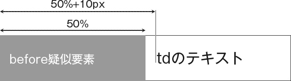
paddingのleftをcalc(50% + 10px)にしている理由を上記イメージでわかってもらえたと思います。
2つのパターンを比較するtable
自社は他社と比べてこんなところがいいですよ!みたいな感じで、比較する表をtableで組んだときのレスポンシブ対応の方法です。
実際に実装したのがこちらです。
See the Pen table responsive support3 by takblog (@blanks-site) on CodePen.
これはposition:sticky;を使用しました。
次がスマホ時のcssです。
コードをクリップボードにコピー
table {
  display: block;
}
table thead, table tbody, table th, table td {
  display: block;
  width: 100%;
}
table td, table th {
  padding: 10px;
}
table thead {
  position: sticky;
  top: 0;
  z-index: 2;
}
table thead tr {
  display: flex;
}
table thead th {
  display: block;
  flex: 0 0 50%;
  max-width: 50%;
}
table thead th.smt-hide {
  display: none;
}
table tbody {
  border-top: 1px solid #111;
}
table tbody tr {
  display: flex;
  flex-wrap: wrap;
  border-left: 1px solid #111;
}
table tbody th {
  flex: 0 0 100%;
  width: 100%;
  font-weight: bold;
  font-size: 16px;
  text-align: center;
  background-color: #eee;
  border-right: 1px solid #111;
  border-bottom: 1px solid #111;
}
table td {
  flex: 0 0 50%;
  width: 50%;
  border-right: 1px solid #111;
  border-bottom: 1px solid #111;
}
theadにposition:sticky;を使用して、スクロールしても常に上に表示されるようにしています。
比較表のような時はこのような表示が分かりやすく伝わると思います。
列数も行数も多い場合
列数も行数も多い場合はそのままtableで表示してしまいます。
もちろんそのまま表示すると、読みづらくなるので少し工夫をします。
次が実装したものです。
See the Pen table responsive support4 by takblog (@blanks-site) on CodePen.
次がcssです。
コードをクリップボードにコピー
/* tableを囲むdiv */
.tableScroll {
  width: 100%;
  max-height: calc(100vh - 40px);
  overflow: auto;
  -webkit-overflow-scrolling: touch;
  overflow-scrolling: touch;
}

table {
  width: 100%;
  min-width: 800px;
  table-layout: fixed;
}
table th {
  background-color: #ddd;
}
table th, table td {
  padding: 10px;
  border: 1px solid #111;
}
table thead th {
  position: sticky;
  top: 0;
  z-index: 1;
}
table tbody th {
  position: sticky;
  left: 0;
  z-index: 2;
}tableをdivで囲んで、囲んだdiv要素にoverflow:auto;のstyleを当てています。
またスマホ時にスムーズにスクロールできるように、
overflow-scrolling: touch;を追加しています。
tableは読みやすい最低のwidthをmin-widthで設定しています。
またスクロールしても項目名が分かりやすいように、theadとtbodyのthにそれぞれposition:sticky;を使用していますが、これはなくても問題ないと思います。
tableをどうやってレスポンシブ対応させようと困ったときは参考にしてみてください。